
 Daniel Carter
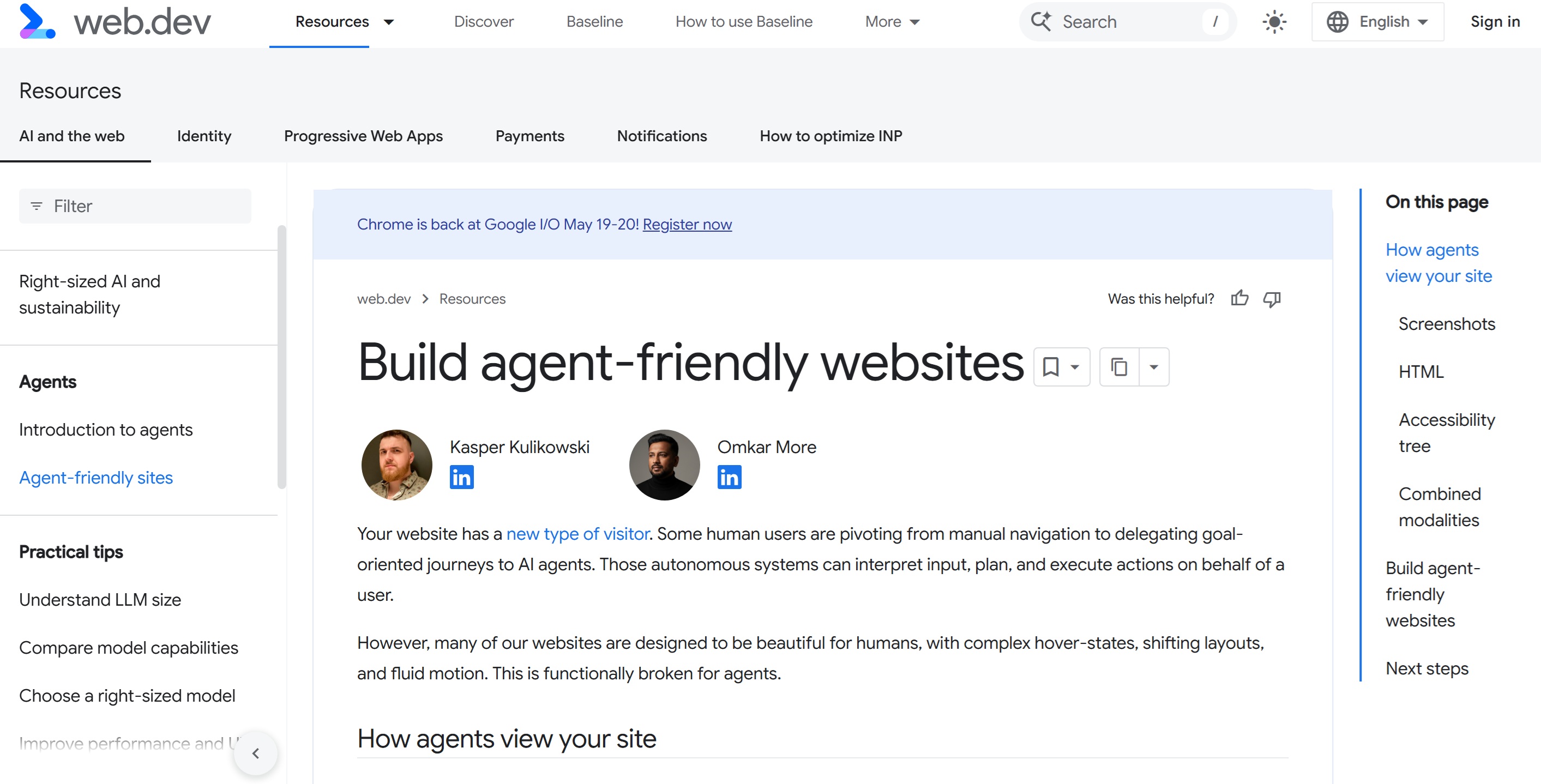
After 25 years of building and ranking websites, I have watched the way people interact with the web go through several shifts, some minor, some major. Each one has demanded that we rethink how we build. The current shift, towards agents acting on behalf of users, is the one I think site owners need to take most seriously, and the early signals of how it changes the work are now clear enough to plan for.
Let's face it, whether we like it or not, agentic web is coming - as Google retains more and more searchers (zero click) it's very probable that this will only increase as google brings commerce direct to AI mode and perhaps, traditional search.
Google has published practical guidance on what makes a website agent-friendly (which you can see here - https://web.dev/articles/ai-agent-site-ux), alongside a new proposed web standard called WebMCP. Both sit on top of fifteen years of accessibility work that most commercial sites have ignored. I have gone through all of that material and want to set out, in plain terms, what site owners and developers actually need to do, why each piece matters, and how it maps to real client situations I see every week.
This isn't specifically for SEOs but also for web developers too!
This is a longer read than you might expect. I have tried to pull together the relevant pieces from across Google’s accessibility course rather than restating the headline article, because the headline article is short & the depth lives in the supporting material. If you read nothing else, the takeaway is this: the work that makes a site ready for agents is the same work that has made sites ready for keyboards, screen readers, and slow connections for the past two decades. The arrival of agents has just made it commercially urgent again.
Accessibility has never been "sexy" and for most, it was totally ignored, remember the days of W3C? yeah, so do we and even to this day, a lot of websites get a lot of basic "accessibility" principles wrong. Except, humans are more forgiving that AI bots, they have to go by what they see in a render.
So, here goes nothing:
1. A new kind of visitor

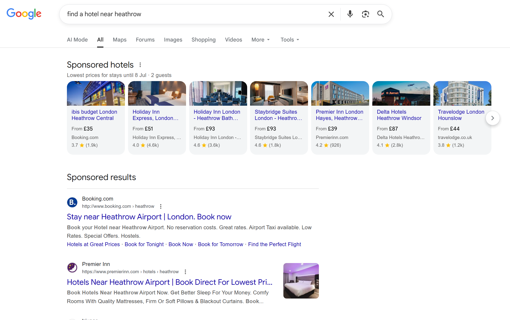
The model of a person sat at a screen, reading copy, hovering over menus, and clicking through to a checkout, has been the basis of web design for over two decades. Increasingly, that journey is being delegated. Someone tells an agent "find me a hotel near Heathrow under £180 a night with a gym, book it in my name" and the agent does the navigating, filling, comparing, and submitting.
Whether you think this is the future of the web or a passing trend, the technical fact is that these systems are now arriving at sites and trying to act. If your site cannot be parsed reliably, the agent will either fail silently, fall back to slower visual analysis, or give up and try a competitor. None of those outcomes work in your favour.
What strikes me most when I audit client sites with this view is how small the changes need to be. The work is not a rebuild. It is closer to going back through the codebase and removing a lot of accumulated shortcuts: divs that should have been buttons, headings used for visual sizing, forms held together with bespoke JavaScript instead of native HTML.
Heck, half the websites I audit still fail basic accessibility and alongside that, many have layout issues, unclosed tags, stray divs amongst many other things - definitely things you do not want with upcoming agentic web.
2. How agents actually see your site
Agents do not experience your website the way a person does. They do not pause on a hero image, they do not admire your typography, and they do not wait for animations to finish. Google’s documentation describes three primary channels through which agents read a site, and understanding all three changes how you make decisions about design and code.

Screenshots and visual analysis
A vision model takes a snapshot of the rendered page and tries to identify what is interactive. Big buttons, prominent search bars, and clear forms get recognised as such. Visual cues are useful: colour, size, and proximity all influence how the agent ranks the importance of an element. A large red "Delete" button will be treated with more caution than a small "Help" link sitting off to one side.
The cost of this approach is real. Vision analysis is slow and expensive in tokens, so it tends to be used as a fallback when the structured channels are confusing. If your page can only be understood through screenshots, every interaction is going to be slower, less reliable, and more likely to abandon.
Raw HTML and the DOM
The agent reads the DOM directly. It looks at how elements are nested, which IDs and classes exist, and how interactive elements relate to surrounding content. If a "Buy Now" button sits inside a product container, the agent can reason that the button belongs to that specific product. This is faster and cheaper than vision analysis, but it depends entirely on the markup actually meaning what it appears to mean.
This is where most client sites I look at start to break down. A product card built as a tangle of nested divs, with onclick handlers attached at random levels, gives the agent no clean structure to reason about. A product card built as a semantic article with a heading, a price, an image, and a button gives the agent everything it needs in seconds.
The accessibility tree
Google has created a mini-course for accessibility here, check it out - be warned, you'll need a few coffees to get through this (https://web.dev/learn/accessibility) This is the channel most site owners have never looked at, and it is quietly the most important. The accessibility tree is a browser-native API that distils the DOM down to roles, names, and states of interactive elements. It strips the visual noise from CSS and gives a clean semantic map of the page. Modern browsers expose it specifically so that assistive technology can navigate complex applications.
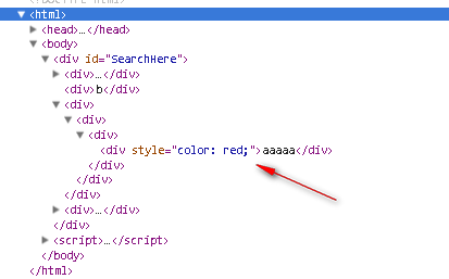
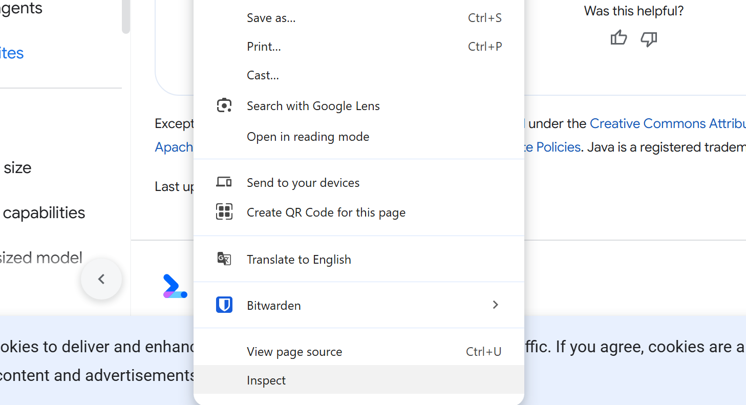
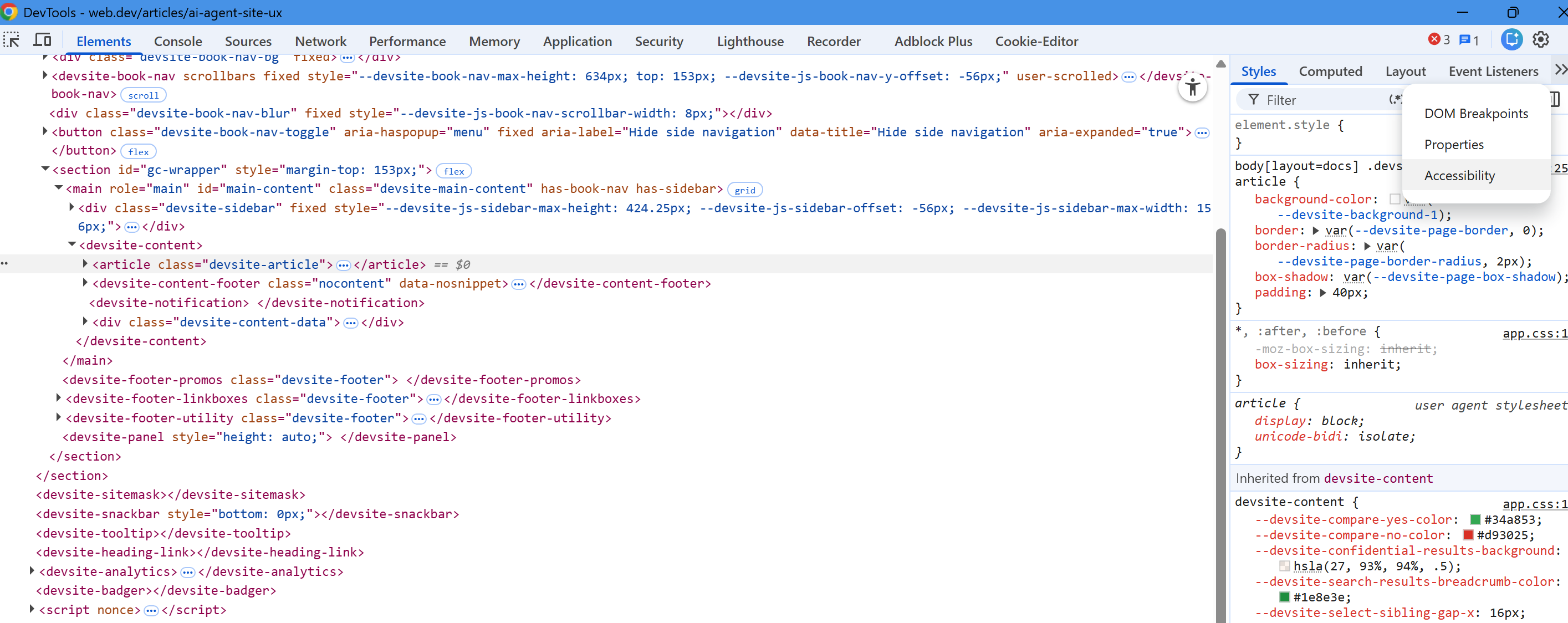
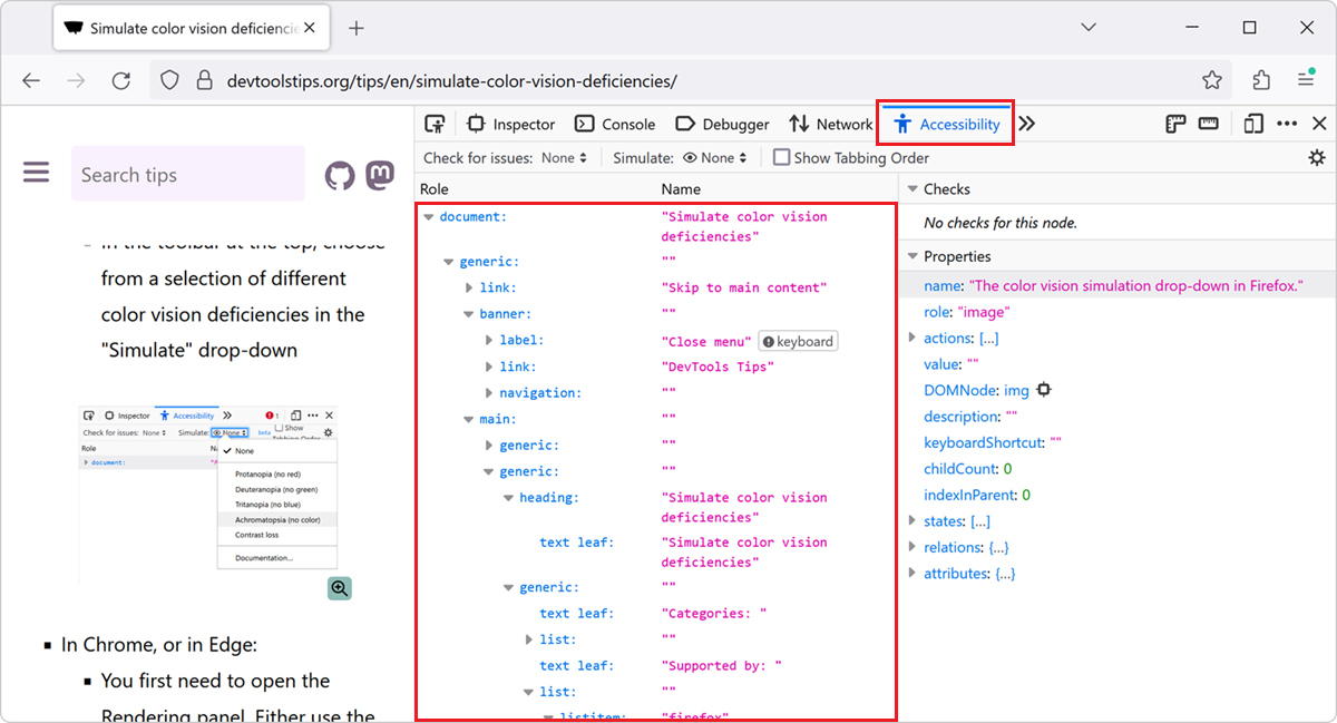
You can preview the accessibility tree in Chrome DevTools by opening the Elements panel (Hit F12 and click INSPECT)
then the Accessibility pane on the right. Recent versions of Chrome let you see the full tree. I would treat that as the single most useful audit you can run on a page that you care about. If the accessibility tree shows a clean hierarchy of named, roled elements, agents will work with it. If it shows a forest of "generic" containers with no names, agents will struggle.
The accessibility panel is tucked over in the far right, click the little chevron icons and it will show in the drop down -
Combined modalities
Modern agents combine all three channels. They use the DOM and accessibility tree to get a clean, structured list of interactive elements, then cross-reference that against a screenshot to confirm layout, grouping, and visual cues. Relying on a single input creates what Google calls a "semantic gap" - to note I hate the word semantic, it's thrown around so much by the AI bros community, but using it here in context, anyhow, in the DOM, an agent might see a div without knowing you have actually configured this as a functional button with CSS and JavaScript. In a screenshot, the agent might identify where that button sits, but it will not understand the action it is designed to trigger. The combined view solves that, but only when the underlying signals are clean.
Our job, as site owners, is to give clean signals across all three channels. The work for each is largely the same, which is what makes this exercise worthwhile.
3. The semantic gap, and why most sites are sitting in it
I see this constantly when auditing client sites. A page might have a perfectly functional "Add to Basket" button. Visually, it does its job. Underneath, it is a div styled to look like a button, with no role, no proper label, and no keyboard support. A human user clicks it without thinking. An agent reading the DOM has no signal that this thing is interactive at all.
This is the semantic gap. The visual rendering and the machine-readable structure do not match. When that gap is small, the agent bridges it cheaply through cross-referencing. When the gap is large, the agent has to fall back on vision, which is expensive and unreliable. When the gap is huge, the agent gives up - not something you want, especially with "agentic web" and google's upcoming UCP (universal commerce protocol).
In commercial terms, the cost of the semantic gap is roughly the same as the cost of slow page speed: a percentage of conversions you do not see, distributed across all the agent traffic you would otherwise capture. We are still early enough that this number is hard to quantify, but it will not stay hard to quantify for long. Anyone running an SEO programme is already used to losing share to faster, cleaner sites; the agent layer adds another dimension to the same problem.
Closing the semantic gap is mostly a matter of using the platform as it was designed. The rest of this article walks through how, working from the foundations upward.
4. Foundation 1: semantic HTML and the five rules of ARIA
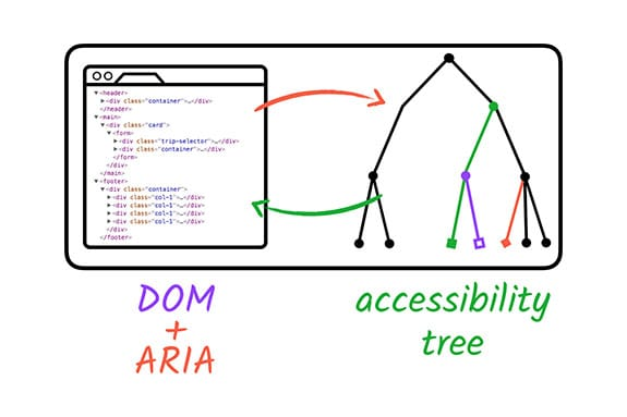
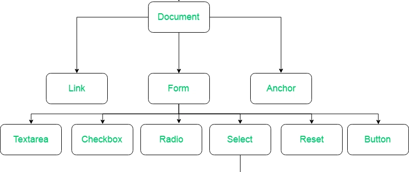
The single most valuable change you can make on most websites is to stop building interactive components from generic divs and spans. HTML has been quietly accumulating better elements for years. There are over a hundred HTML elements available, and the vast majority of UI patterns can be built without reaching for ARIA at all. Google made a nice little DOM + ARIA graphic -
The Web Accessibility Initiative published five rules of ARIA, and every single one of them applies just as cleanly to agent-readiness as it does to screen reader support.
Rule one: do not use ARIA
Yes, that is the actual first rule, and it surprises most developers when they first read it. Adding ARIA to an element does not inherently make it more accessible. The WebAIM Million annual accessibility report has consistently found that home pages with ARIA present averaged around 70 percent more detected errors than those without ARIA, primarily because the attributes were implemented incorrectly.
When the browser supports an HTML tag with a built-in role, there is no need to add ARIA. Use a button tag instead of a div with role="button". Use an anchor tag instead of a span styled to look like a link. The browser gives you correct keyboard behaviour, focus states, accessibility tree entries, and a sensible default appearance for free.
Rule two: do not add unnecessary ARIA
Where HTML elements work as-is, leave them alone. Adding role="list" to a ul element is redundant. Adding role="button" to a button is redundant. The classic mistake here is wrapping a heading element in a tab role, which then forces you to add code to make the element behave like a tab. You have done extra work for a worse outcome.
Rule three: always support keyboard navigation
All interactive ARIA controls must be keyboard accessible. If you have built a custom component, you can add tabindex="0" to give it natural focus order. Avoid positive tabindex values: they jump elements out of DOM order and create unpredictable focus paths that break for keyboard users and confuse agents alike.
The agent angle here is that agents often act through the same channels as keyboard users. They tab through interactive elements, fire keypress events on focused elements, and read out the resulting state. If your keyboard navigation is broken, your agent navigation is broken in the same places.
Rule four: do not hide focusable elements
Do not add role="presentation" or aria-hidden="true" to elements that need to receive focus. This is a surprisingly common bug: a wrapper element gets aria-hidden as part of a modal or popup pattern, and the focusable button inside it becomes invisible to assistive technology and to agents. The keyboard can still focus it, but nothing in the accessibility tree announces what it is.
Rule five: use accessible names for interactive elements
Every interactive element needs an accessible name that conveys its purpose. The accessible name can come from text inside the element, alternative text on an image inside it, an associated label, or an aria-label attribute. The bar for this is straightforward: if you read out only the accessible names of elements on the page, in order, would the page make sense?
Most sites I audit fail this test on icon-only buttons. A magnifying glass icon used as a search button, with no aria-label and no surrounding text, is unnamed in the accessibility tree. A human knows what it does. An agent does not.
5. Foundation 2: knowing what your accessibility tree looks like
I want to spend a little more time on the accessibility tree, because it is the part of this story most people have never looked at, and because it is the single best diagnostic tool you have.
The accessibility tree is built by the browser based on the standard DOM tree. Like the DOM, it contains objects representing markup elements, attributes, and text. Unlike the DOM, it is filtered, named, and roled in a way that maps to what assistive technology can use. Platform-specific accessibility APIs (different on Windows, macOS, Linux, iOS, and Android) sit on top of this tree and present it to screen readers, switch devices, and now to agents.
ARIA is not a programming language. It is a set of attributes that modify what ends up in the accessibility tree. Roles, properties, and states are the three components: roles define what an element is, properties express characteristics or relationships, and states define the current condition (pressed, expanded, selected, and so on). When the underlying HTML is right, ARIA is barely needed. When you have to use ARIA, get it right or you make things worse.
To inspect the tree on any page, open Chrome DevTools, go to the Elements panel, and look at the Accessibility pane. You will see a hierarchy of nodes with their roles and names. If your most important page on your most important user journey shows a flat list of generic nodes with no names, you have found a serious problem before you have started auditing anything else.
6. Foundation 3: content structure
Content structure is where the underlying outline of the page lives. Get this wrong and agents will struggle to work out what they are looking at, regardless of how clean the rest of the markup is. Get it right and most of the rest of agent-readiness falls into place.
Landmarks
Landmarks are the named regions of the page. The HTML elements that map to landmark roles are header (banner), nav (navigation), main (main), aside (complementary), footer (contentinfo), form (form), and section (region, when given a name). Every page should have at least one landmark, and most pages should have several. The reason is operational: agents and assistive technology use landmarks to jump straight to the part of the page that matters.
I see two recurring failures here. The first is sites that wrap everything in divs with no landmarks at all, leaving the agent to guess where the navigation ends and the main content begins. The second is sites that have correct landmarks but use them inconsistently across templates, so the agent has to relearn the page structure on every visit.
Heading hierarchy
Heading levels form the outline of the page content. H1 is the most important, H6 is the least. The sequence matters: ideally you do not skip levels, you do not start a section with H1 and immediately follow it with H5, and you do not use heading tags purely for visual sizing.
The mistake I see most often on marketing sites is using H3 instead of H2 because someone thinks H2 looks too big in the design. The fix is to decouple your CSS from the heading levels: style each heading the way you want it to look, but use the right tag for its position in the outline. This gives the design team total flexibility on appearance and the structure team a clean machine-readable hierarchy.
Agents use heading order to build a working model of "what this page is about". If your heading order is broken, the model is broken before the agent has read a single word of body copy.
Lists and tables
A list of items should be a ul, ol, or dl element with li or dt and dd children. When an agent or screen reader encounters a real list, it can tell the user there are five items, and as it moves through them it can announce "item three of five". When the same items are rendered as styled paragraphs, none of that structure exists.
Tables are the area where I see the most damage on B2B and SaaS sites. Pricing comparison grids, feature matrices, and specification tables all get built as flexbox or grid layouts because the design team wants more control. The output looks fine on screen and is invisible to anything that needs to read the relationships between rows and columns.
A real data table needs th elements for headers and td elements for data cells. For complex tables you might also need scope attributes, caption elements, or rowgroup and colgroup. A layout table, used for visual arrangement only (this still happens in HTML email), needs role="presentation" so it is hidden from assistive technology entirely.
7. Foundation 4: focus and keyboard interaction
Focus is the element on the screen actively receiving keyboard input. It matters for keyboard users, for screen reader users, and now for agents that act through keyboard channels. There are three things you need to get right.
Focus order
The default focus order, the sequence in which elements receive focus as a user tabs through the page, must be logical, intuitive, and match the visual order. For most languages this means top to bottom, left to right.
Naturally focusable HTML elements (links, buttons, form fields) are included in focus order automatically. If you need to make a non-focusable element focusable, give it tabindex="0" and it will be included in DOM order. If you need to remove an element from focus order, give it tabindex="-1". Avoid positive tabindex values like tabindex="1": they create a custom order that overrides DOM order, and they almost always break later when the page evolves.
Focus indicators
Browsers add a default focus indicator when an element receives focus, typically a blue ring or outline. CSS resets, particularly older ones, frequently turn this off with outline: 0 or outline: none. Doing this without providing an alternative focus style is one of the worst things you can do for keyboard accessibility.
If you want to style your own focus indicator, do so. Use background changes, borders, underlines, or anything else that meets a 3:1 colour contrast ratio against the surrounding background. Just do not strip the default and leave nothing in its place.
For agents, the focus indicator is also a useful visual signal during cross-referencing between the DOM and the screenshot. An agent that can see clearly where focus has landed can confirm its action took effect.
Skip links
Most sites have a long header with navigation links at the top of every page. For keyboard users, tabbing through 30 nav links every time they land on a new page is exhausting. The fix is a skip link: an anchor link, typically the first focusable element on the page, that jumps the user past the header to the main content.
Skip links are usually visually hidden until they receive focus. They cost nothing to implement and they materially improve the experience for anyone who is not using a mouse. Agents benefit too, because the same skip link gives them a fast route to the part of the page that matters.
8. Foundation 5: making interactive elements actually look interactive
Google’s headline guidance includes a handful of specific signals that make a difference, and they are all worth taking seriously.
Use semantic elements for actions
Prefer button and anchor tags over modified divs and spans. Where you genuinely cannot use semantic HTML, give the element the right role and tabindex. A div with role="button" and tabindex="0" is far more parseable than a bare div with a click handler. But the bare button is always better than either.
Set cursor: pointer
It sounds trivial, but Google specifically calls this out. The CSS cursor property is read by both vision models and HTML parsers as a signal of actionability. If you have built a custom interactive element and not set cursor: pointer on it, you are leaking signal that you did not need to leak.
Keep target sizes generous
Make sure interactive elements have a visible area larger than 8 square pixels, otherwise they risk being filtered out as visual noise during screenshot analysis. WCAG 2.2 has a stricter target size minimum (24 by 24 CSS pixels) that I would treat as the practical floor on any new build. Touch users, low-vision users, and agents all benefit from generous hit areas.
Avoid ghost elements and overlapping overlays
Transparent overlays, ghost elements, and stacking issues are a real problem. If an interactive node is covered, even by something that is visually transparent, screenshot analysis may discard it entirely. I see this on cookie banners that linger after fading, intent popups that intercept clicks long after they should have dismissed, and chat widgets that overlap calls to action on mobile breakpoints.
Audit your z-index stack. If an agent’s vision model cannot see the button, the agent cannot act on it.
Hover-only interactions
A nav menu that only appears on hover, with no equivalent for touch or non-pointer environments, hides itself from agents entirely. The same applies to tooltips that contain essential information, dropdowns that open only on hover, and content that depends on cursor position to reveal itself. WCAG 2.1 has a specific success criterion (1.4.13 Content on Hover or Focus) that addresses this. The fix is to make any hover behaviour also work on focus, and to make the visible content persist long enough to read or interact with.
9. Foundation six: forms, where agents do most of their real work
Forms are the single highest-stakes surface for agent-readiness. A checkout, a booking flow, a support ticket, a sign-up: this is where the actual value of agent traffic gets created or lost. The form-related accessibility patterns deserve more attention than the rest combined.
Use real form elements
Use form, input, select, textarea, and button. Built-in elements come with browser-level support for things like autofill, validation, and assistive technology integration. Custom form fields built from divs and spans require you to manually add roles, states, keyboard support, and announcements. It is almost always more work for a worse outcome.
Connect labels to inputs
Every form field needs a label. The cleanest pattern is a label element with a for attribute pointing to the input’s id. This creates an explicit programmatic association between the two, so assistive technology and agents both know which label belongs to which field.
Wrapping the input inside the label also works. What does not work is putting a styled span next to the input and assuming proximity is enough. Spatial proximity is what agents have to fall back on when the explicit association is missing, and it goes wrong on responsive layouts where the visual order changes.
Use autocomplete attributes
This is one of the highest-value, lowest-effort improvements you can make. The autocomplete attribute tells the browser, assistive technology, and agents what the field is for. autocomplete="email", autocomplete="tel", autocomplete="bday", autocomplete="given-name", autocomplete="postal-code". The full list is long and well documented.
Autocomplete attributes do three things at once: they let users autofill from saved data, they let agents understand the field’s purpose with no ambiguity, and they help with WCAG 2.1’s Identify Input Purpose criterion. The cost of adding them on a typical checkout form is fifteen minutes. The upside is real for every category of visitor.
Group related fields
A mailing address is not five separate fields, it is one logical group of five fields. Use fieldset to wrap the group and legend to describe it. Same applies to radio button groups, sets of related checkboxes, and any cluster of inputs that belongs together conceptually.
Without grouping, an agent has to infer which fields go together based on layout, labels, and field types. With proper grouping, the relationship is explicit and the agent can fill the whole address in one structured action.
Handle errors properly
When a user makes a mistake on a form, the error needs to be made known. The field where the error occurred must be clearly identified, and the error itself must be described in text. Inline errors near the field are usually better than a single error block at the top, but both can work.
Use aria-describedby to link an input to its error message, so assistive technology and agents can read both the label and the error together. Use aria-invalid to mark the field as currently in an error state. Use aria-live regions to announce dynamic error messages that appear without a page reload.
The quiet failure mode I see most often is a form that turns the field border red and shows a tooltip on hover. The visual signal is there. The accessibility tree shows nothing. An agent submits the form, the agent reads the page, the page looks fine, the agent reports success. The form was never actually submitted. This is the kind of failure that erodes trust in agents and in the sites they act on.
Forms should not surprise users
Form fields should not produce contextual changes when they receive focus or user input, unless the user has been warned. A form should not auto-submit when a field receives input. A field should not silently change a value elsewhere on the page that the user cannot see. These patterns break for anyone using assistive technology, and they break the trust model that lets agents act on a user’s behalf.
10. Foundation 7: images and visual content
Images are not a tick-box exercise of "add alt text and move on". The right approach depends on what the image is doing on the page. Google’s accessibility material breaks images into four categories, and the same categorisation helps agents work out which images they need to attend to and which they can ignore.
Decorative images
A decorative image adds no information. It is there for atmosphere, balance, or visual rhythm. Decorative images should be programmatically hidden from assistive technology with empty alt text (alt=""), with role="presentation", or by being applied as CSS background images. The signal you are sending is "ignore this, it adds nothing to the meaning of the page".
Informative images
An informative image conveys a concept, idea, or emotion that would be lost without it. Photos of products, diagrams of processes, charts, and illustrations that carry meaning all fall into this category. They need alt text that captures the relevant visual information succinctly. Around 150 characters is a sensible upper bound; if you need more, link to a longer description on the page.
For agents reading screenshots, good alt text confirms what the vision model is already seeing. For agents reading the DOM, good alt text is the only signal they have. An informative image with alt="" or no alt at all is invisible.
Functional images
A functional image is an image attached to an action: a magnifying glass icon that triggers search, a logo that links to the home page, a social media icon that opens a share dialogue. The alt text needs to describe the action, not the image. "Search" is correct alt text for a magnifying glass icon used as a search button. "Magnifying glass" is not.
Complex images
Charts, infographics, maps, and complicated diagrams need both a short description and a longer one. Use the alt attribute for the short description and either a linked text equivalent on the page or aria-describedby pointing to a longer description block. The figure and figcaption elements are useful here too, because they create a semantic relationship between the image and its caption.
A note on alt text quality
Alt text written like a human is read more easily by both humans and machines than alt text stuffed with keywords. Keyword-stuffed alt text is annoying for screen reader users, ignored by modern search engines, and confusing for agents trying to verify what an image actually shows. Avoid phrases like "image of" or "photo of"; the screen reader and the accessibility tree already announce that it is an image.
11. Foundation 8: JavaScript and dynamic content
Almost every site I audit runs on a JavaScript framework now. React, Vue, Angular, Svelte, and the various meta-frameworks layered on top of them dominate the new build market. JavaScript brings four specific patterns that need attention if you want your site to be agent-friendly.
Trigger events on the right elements
An onClick handler on a button or anchor tag works for both mouse and keyboard automatically. An onClick handler on a div does not. Adding role="button" and tabindex="0" to a div gets it focusable, but to actually fire on Enter or Space you have to add explicit keydown or keyup handlers. This is forgotten more often than not. The result is a component that works for mouse users and silently breaks for everyone else, including agents.
Page titles in single-page apps
Single-page apps load from one index.html file and update content with JavaScript routing. By default, the page title does not change between routes. For screen reader users, this means every page sounds the same. For agents, it means the same problem: the title is one of the strongest signals an agent uses to confirm it has navigated to the right place.
Update document.title on every route change. Most modern frameworks have helper packages or built-in solutions for this. Treat it as table-stakes for any SPA.
Dynamic content and ARIA live regions
When content appears on the page after the initial load, for example a confirmation message after a form submission, you need to make sure assistive technology and agents pick it up. The mechanism is the ARIA live region: a hidden or visible area marked with aria-live="polite" or aria-live="assertive" that announces its content when it changes.
A common bug here is creating the live region dynamically at the same time as the message you want to announce. That does not work. The live region must exist in the DOM at page load, and the text inside it gets swapped out when there is something to announce. Most major frameworks have live announcer packages that handle this for you.
Focus management in modals and routes
When a modal opens, focus needs to move into it, and the user should not be able to tab outside the modal until it is dismissed. When the modal closes, focus needs to return to the element that opened it. Failing to manage focus correctly here creates "keyboard traps" or "focus loss" that disorients users and confuses agents.
When a route changes in an SPA, the development team has to decide where focus goes. Common patterns are placing focus on the main content container, moving it to the top-level heading of the new page, or moving it back to a skip link. The decision matters less than picking a consistent pattern and applying it everywhere.
Less JavaScript is usually better
Where the same effect can be achieved in CSS, prefer CSS. Animations, sticky navigation, hover states, and basic transitions are all faster, lighter, and more accessible when handled in the stylesheet. Inline styles applied via JavaScript are particularly worth avoiding: they are harder to override, they bypass user stylesheets, and they tend to accumulate over time as patches.
12. Foundation 9: layout stability and consistency across templates
Google’s guidance includes a specific point about layout stability that I think deserves more attention than it gets. Agents that take screenshots will struggle if your website layout is constantly shifting between templates of the same type. If your "Add to Cart" button is in different positions across product categories, the agent has to relearn the page on every visit.
Humans tolerate this because we have visual context and intent. Agents do not have intent in the same sense. They want the same action in the same place. When the action moves, the cost of every interaction goes up, and at some threshold the agent stops being able to reliably complete the journey.
The real-world version of this I see most often is ecommerce sites where developers have layered in A/B tests, seasonal banners, and category-specific overrides until the same product type behaves differently depending on which traffic source the visitor came from. This was already bad for conversion rate optimisation; it is now a third-order problem because it makes agent journeys unreliable.
A simple discipline helps: define a small set of page templates, one per content type, and enforce them. Product pages all share a structure. Category pages all share a structure. Article pages all share a structure. Personalisation and testing happen inside slots within the template, not by replacing the template wholesale.
13. The deeper observation: design consistency is now an operational concern
This is the part of the article that goes beyond Google’s direct guidance, but I think it is the most consequential point for site owners.
Language models, and the agents built on top of them, perform best on patterns they recognise. They were trained on a snapshot of the web that was full of conventional patterns: standard navigation in a header, products in a grid, checkouts that follow a familiar sequence, contact forms with name and email fields. The more your site looks and behaves like a normal example of its category, the easier it is for an agent to reason about.
That does not mean every site has to look the same. It does mean that radical departures from convention have a cost that did not exist before. A checkout page that buries its "Continue" button inside a third-level accordion is technically novel and practically broken. A nav menu that only appears on hover hides itself from agents entirely. A product card that uses unconventional iconography for "Add to Basket" is harder to recognise than one that uses a clearly labelled button.
There is an SEO parallel worth noting. We have spent fifteen years telling clients that their pages need to look like "what users expect" because that is what search engines reward. The agent layer is doing the same thing through a different mechanism. The signal flows through how recognisable your patterns are to a model trained on the web at large.
The seven inclusive design principles that the accessibility community has been pushing for years map onto agent-readiness almost line for line:
1. Provide a comparable experience: an interface that gives every user, automated or otherwise, a path to the same outcome.
2. Consider the situation: think about how your interface degrades on slow connections, on small screens, in noisy environments, and now under agent control.
3. Be consistent: use familiar conventions and apply them in the same way across the site.
4. Give control: let people interact with content in their preferred way, including delegating to an agent.
5. Offer choice: provide more than one route through complex tasks.
6. Prioritise content: arrange the page so that the core task is identifiable from structure alone.
7. Add value: every feature on the page should justify the cognitive and parsing cost it imposes.
Read those again with the agent in mind. Every one of them is an instruction that improves agent-readiness, even though none of them mentions agents.
14. The accessibility heuristics, applied to agent-readiness
Deque’s research, published a few years ago, found that up to 67 percent of all accessibility bugs on a website can be avoided when accessibility is part of the design process rather than added later. They produced ten heuristics, modelled on Nielsen and Molich’s original ten usability heuristics, that I think are the single best evaluation framework for agent-readiness as well.
• Interaction methods and modalities: users (and agents) can act with the input method of their choosing. If the only way to operate something is a precise mouse drag, you have a problem.
• Navigation and wayfinding: users can navigate, find content, and determine where they are at all times. Page titles, breadcrumbs, headings, and landmarks all feed this.
• Structure and semantics: users can make sense of the page structure and understand how to operate within the system. This is the accessibility tree, expressed differently.
• Error prevention and states: interactive controls have persistent, meaningful instructions to prevent mistakes, and provide clear error states when something goes wrong.
• Contrast and legibility: text and meaningful information are easy to distinguish and read. WCAG sets the floor at 4.5:1 for body text and 3:1 for large text.
• Language and readability: content is written at a level the audience can read. This is one of the few heuristics that genuinely benefits agents in both directions, because they parse simpler language faster.
• Predictability and consistency: every element’s purpose is predictable, and its relationship to the rest of the system is clear.
• Timing and preservation: users have enough time to complete tasks, and they do not lose information if they take longer than expected.
• Movement and flashing: animation and motion can be paused. This is partly a safety issue and partly an attention issue, and agents tend to ignore animated content during analysis anyway.
• Visual and auditory alternatives: text-based alternatives exist for any visual or auditory content that conveys information.
I would run a heuristic review on your three highest-traffic templates as a baseline. Take each heuristic, score the page against it (excels, passes, fails, or not applicable), and see where the weak points are. Most teams find clusters of failures around the same heuristics across all their templates, which is a useful signal for where to focus the first round of fixes.
15. Patterns and design systems: build on what works
"Component-driven development has been the dominant pattern in serious web build for the last decade. Pattern libraries, design systems, and component frameworks let teams break a large product into reusable pieces. This is broadly a good thing for agent-readiness, but only if the components themselves are accessible to start with."
There is a strong case for using established, audited design systems rather than building your own from scratch. The GOV.UK Design System and the United States Web Design System (USWDS) are both excellent starting points. They have been tested at scale, they cover most common patterns, and they document accessibility decisions explicitly. For JavaScript frameworks, accessible component libraries like ReachUI, Reakit, and Chakra for React, Material for Angular, and Vuetensils for Vue, give you a defensible default.
What does not work is copying components from random sources without testing. Just because a Codepen example has aria attributes does not mean it is accessible. Just because a Tailwind starter labels itself as accessible does not mean it has been tested with screen readers, let alone with agents. Treat any external component as a starting point and test it against your own user journeys before you ship.
The questions to ask of any pattern, library, or design system are: does an established accessible version already exist? What browsers and assistive technology am I supporting? Are there code or framework limitations that constrain my options? What integrations or third parties might I need to work around?
16. WebMCP: declaring your intent to agents directly
Alongside the agent-friendly guidance, Google has launched an early preview programme for something called WebMCP. WebMCP is a proposed web standard that lets a site explicitly expose structured tools to agents. Instead of an agent guessing how to book a flight on your site, you tell it directly: here is the search action, here are the parameters, here is the result format.
Two APIs are being proposed. A declarative API for standard actions defined directly in HTML forms. An imperative API for more dynamic interactions that need JavaScript to express. The declarative version makes the most sense for typical commerce and lead-generation flows; the imperative version is closer to the kind of programmatic capability that complex SaaS dashboards already expose to power users.
The use cases Google highlights are familiar territory. Customer support tickets, where an agent fills in the technical details automatically. Ecommerce, where an agent finds, configures, and checks out a product reliably. Travel, where an agent searches, filters, and books with structured guarantees about the result. None of these are speculative; they are the places where current agent traffic is already trying to operate and frequently failing.
If WebMCP gains traction, it changes the picture significantly. Sites will be able to advertise their capabilities to agents in the same way they currently advertise their content to search engines through structured data. The structured-data parallel is worth taking seriously: schema.org markup gave us rich snippets in search results, and the sites that adopted it early gained a measurable advantage. WebMCP looks likely to follow the same arc.
I would sign up to the early preview programme, even if you have no intention of shipping anything imminently. The documentation, demos, and discussion will tell you more about how this is going to settle than any external commentary, and the patterns that emerge from the preview phase are the ones that will end up in the standard.
17. A practical audit you can run this week
Here is the audit I would run on any site that wants to be ready for the next year of agent traffic. It takes a day, maybe two, and it identifies the biggest issues without requiring any specialist tooling.
8. Open Chrome DevTools on your highest-value page (typically the checkout, or whichever page completes the conversion). Look at the Accessibility pane. Note any element with role "generic" that should clearly be a button, link, or landmark.
9. Tab through the entire user journey from landing to conversion using only the keyboard. Note every place where focus disappears, where the focus indicator is invisible, or where you cannot reach an interactive element.
10. Run a screen reader (NVDA on Windows is free; VoiceOver on macOS is built in) through the same journey. Note any place where the announcements are confusing, missing, or wrong.
11. Inspect every form on the site for label associations, autocomplete attributes, and grouping with fieldset and legend. Add what is missing.
12. Check your heading hierarchy on every template. H1 should appear once. Subsequent levels should not skip. Levels should reflect the structure of the content, not the visual sizing.
13. Audit your interactive elements. Anything with an onclick handler should be a button or a link, not a div. Anything that opens a menu or popup should manage focus correctly when it opens and closes.
14. Check your image alt text against the four categories: decorative, informative, functional, complex. Most sites have a mix of all four, treated identically. Fix the ones that are clearly miscategorised.
15. Look at your z-index stack on mobile and desktop. Make sure no overlay, banner, or chat widget is covering an interactive element it should not be covering.
16. Test your most important page templates against each other. A product page on category A should structurally match a product page on category B. If it does not, decide which is the canonical structure and align everything else to it.
17. Run an automated accessibility scan with Lighthouse, axe DevTools, or WAVE. These tools catch a meaningful subset of issues automatically and give you a starting list to work through.
18. Where this leaves us
The thing that strikes me most about Google’s guidance is that almost none of it is new. Use semantic HTML. Build accessible forms. Keep layouts stable. Do not fake interactive elements with div soup. Use proper headings. Style focus indicators. Connect labels to inputs. Manage focus in modals. Announce dynamic content with live regions. Categorise images by purpose. Use established design systems. These instructions have been consistent for fifteen or twenty years, and the people who followed them then are now in the best position for what is coming.
The reason agent-readiness maps so closely to accessibility is that both are downstream of the same underlying property: a site that uses the platform as designed, with clean separation between content, structure, and presentation, is legible to anything that reads it. Screen readers, search engines, keyboard users, slow networks, agents. The audience changes, the requirement does not.
There is a commercial argument worth making explicitly here. Every site has a ceiling on how much it can grow through human traffic alone. The shape of that ceiling has been moving for years, with mobile, voice, and now agents each adding new categories of visitor. Sites that adapt early to each new category have historically captured share that they kept long after the technology stopped being novel. The same dynamic looks likely to apply to agent traffic over the next two to five years. Whether you find that exciting or tedious, it is worth treating as a planning input.
My practical recommendation, after going through all of Google’s material in detail, is to treat the next quarter as a clean-up exercise. Audit the accessibility tree on your highest-value pages. Run a screen reader through your most important journeys. Replace the worst div-button-onclick patterns with real buttons. Add label associations and autocomplete attributes to your forms. Fix your heading hierarchy. Stabilise your templates. Sign up to the WebMCP early preview programme so you understand what is coming.
None of these are large projects on their own. Together, they put a site in a position where the next phase of the web does not catch it cold. The next visitor to your site might not be human. They will be just as unforgiving of broken structure as any user, and a good deal less patient.
Sources referenced
• Google web.dev: Build agent-friendly websites (web.dev/articles/ai-agent-site-ux)
• Chrome for Developers: WebMCP is available for early preview (developer.chrome.com/blog/webmcp-epp)
• Google web.dev: Learn Accessibility (web.dev/learn/accessibility), including the modules on ARIA and HTML, content structure, the document, keyboard focus, JavaScript, images, forms, patterns and design systems, and design and user experience
• WebAIM Million annual accessibility report
• Deque accessibility heuristics (Deque blog, 2019)
• Nielsen and Molich, ten usability heuristics for user interface design (1990)
• GOV.UK Design System and US Web Design System (USWDS) as referenced examples of accessible component libraries